uxui, vibecoding, datavisualisation
UX Begins Where Vibecoding Ends - How I Turned 10,000 Rows of Data Into an Interactive Data Visualization

Aron Lukacs
Reddit is full of vibecoded fake best practices and "suspiciously-too-good-to-be-true" stories claiming that a vibecoded hobby project turned into a successful digital business overnight. What's missing from most of these accounts, however, is precisely the hard part of the work: the design decisions, the UX nuances, and the critical filter that determines what stays in the product and what doesn't.
Can you learn from them? Maybe. Does this working method work on a real, months-long client project where the design system, data visualization, and usability carry the same weight as the code itself? Partly yes — but only if you're willing to question every AI output twice, with both a designer's and a UX lens.
This isn't your average, SEO-optimized, enthusiasm-overflowing case study. Drawing on practical and hands-on experience, I'll show in detail how I combined classic designer know-how, UX craft, and vibecoding methods so that the end result was a real, production-ready deliverable handed off to a client — and also where the limits of this working method lie.
"Hi, we brought you an ugly PowerPoint — how do we make this fast, beautiful, and smart?"
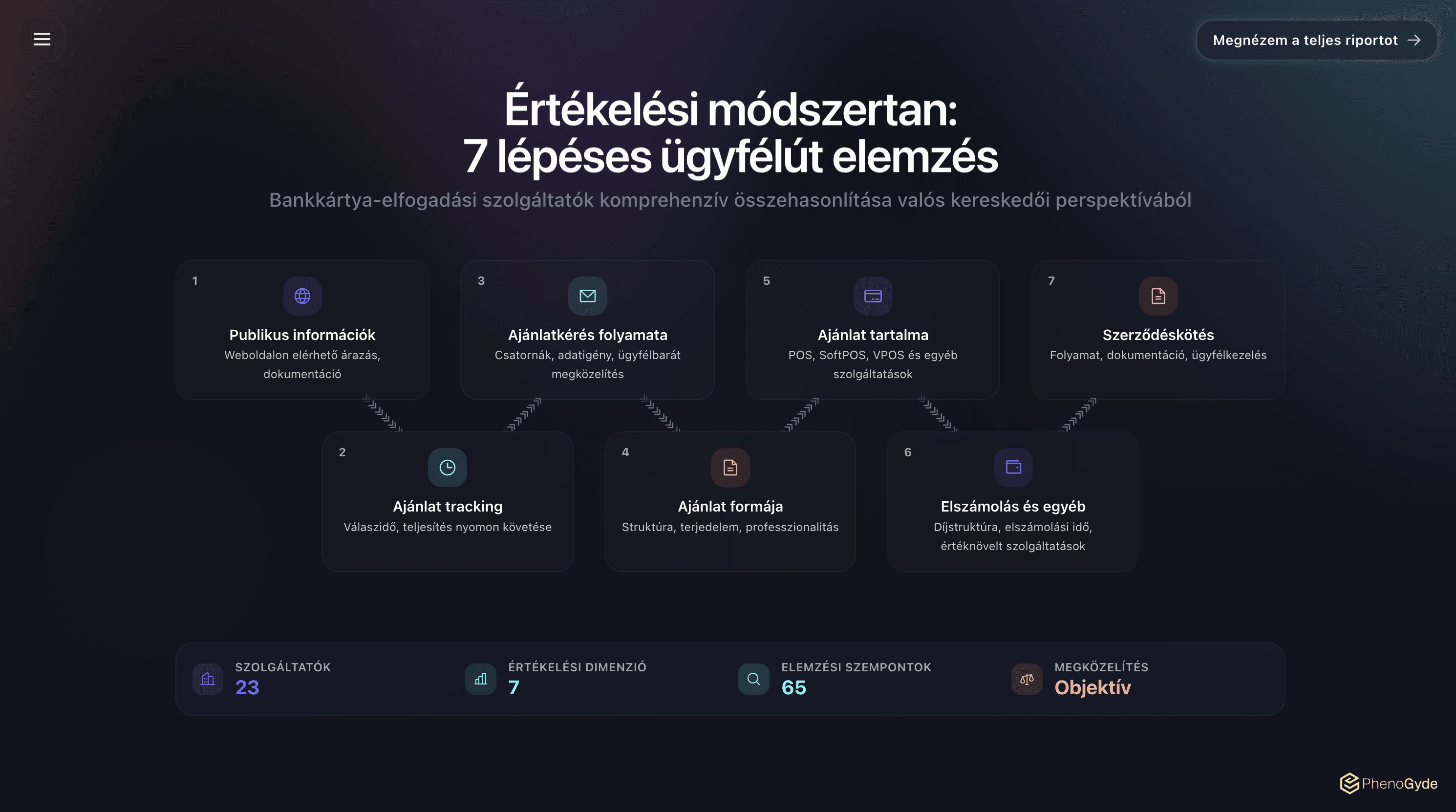
I recently delivered a 150-page interactive market analysis to PhenoGyde, a Hungarian consulting firm specializing in the payments market. The market research presents 23 card acceptors operating in Hungary (Hungarian banks, international fintechs, ...) from an infinite (!) number of perspectives. The presentation generates its slides from a database of 10,000 rows. I worked on it alone. I'm not an engineer.
I did much of the project with Claude Code and Google Antigravity, generally working with the Opus 4.6 / 4.7 models.
By the second week, I was no longer thinking in design and slides. I was building a query interface that happens to look like a presentation. By the end of the project, I had a working idea of how I'd do a similar task completely differently from scratch :D
Here are five things you can copy from me if you find yourself in a similar situation (recommended for laypeople and future clients alike).
1. The deck is actually a database with design
When the brief arrived, we first started pricing it as a Figma redesign. The client handed over a half-finished PowerPoint deck; we'd done plenty of similar projects, so the team sat down at the pricing calculator and got to work on a slide / block / component basis.
We didn't finish.
I was still in the "breaking it down" phase when it hit me: this isn't going to be a classic project. Just one example: on the slides, every card acceptor is crossed with merchant size, acceptance channel, and pricing model, with eight thematic sub-blocks per row — the kind of matrix no designer would happily lay out by hand, and that's before we even talk about iteration rounds :D The methodology notes from the market research were full Hungarian sentences in a single Excel cell. The website-quality matrices showed five evaluation dimensions across 23 providers. Whatever I designed, it had to be able to filter, sort, cross-reference, and update as soon as the data changed.
The deck was actually a database that happened to look like a deck. 🦆
The day this clicked for me, I wrote a parser script that turned the client's master pricing CSV into a typed module and data model, which then went into the codebase, and from then on every chart that displayed a price read from the same source.
No single Figma file or PowerPoint can do this.
What tool you need for a project is determined by the source, the input. Here I was working with dense, structured, queryable material. You can't build this in Figma; you could solve it in Data Studio, but it won't be easily publishable / sellable. With custom development, however, you can create a scrollable, interactive, searchable data visualization that combines the advantages of a database and a beautiful presentation.
2. This is not vibe coding
The term "vibe coding" was coined by Andrej Karpathy in February 2025. He meant something very specific: building weekend, throwaway projects with an LLM where you accept all diffs without reservation, paste errors back without analysis, and slowly forget the code is even there. By vibe coding, he described a working method: fast, flexible, and openly embracing its compromises. After that, the entire internet started using the term to refer to any AI-assisted development.
But that's not what I was doing.
I reviewed every modification, and — yes — I rejected most of them. Simon Willison (one of the creators of the Django web framework) says: "I don't commit a single line of code if I can't explain exactly to someone else what it's responsible for and what it does." PhenoGyde sells its market research to paying clients (banks, fintech companies) in a strictly regulated sector. There's no room for mistakes here; every pixel and every data row had to be perfect.
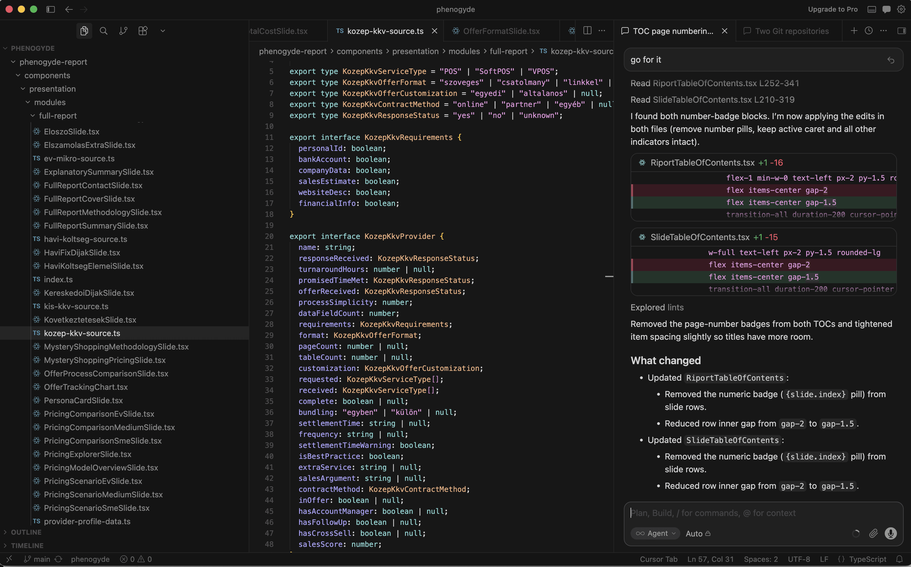
Willison gave this disciplined variant the name vibe engineering.
And let's be honest: most of the criticism leveled at vibe coding is valid. According to Veracode's 2025 study, security vulnerabilities were found in 45% of AI-generated code. Addy Osmani first talked a year ago about AI-generated "house-of-cards code" that looks finished and functional, then collapses under real load.
Writing function plans in bullet points, the classic way, the way the old folks did — then generating specifications and implementation plans from them with AI, verifying those, generating code agentically from them, then auditing it according to predeclared rules and testing it manually? Now that isn't vibe coding — perhaps vibe engineering, but if I want to put it precisely, nothing happens in this process other than outsourcing the production of text and high-level code, while the thinking stays in the right place: with me.
3. Does the designer / interface designer become a system architect?
The most useful thing I learned during the twelve weeks: the skill that's transferable from the design world to AI-assisted coding is critique itself.
The instinct is what's transferable. Breaking a problem into reusable parts. Writing briefs so other colleagues or agents can work with them without you being there. Naming something once and then referring to it by that name everywhere afterward. Accounting for edge cases. Spotting "these three are the same component."
These are all design skills.
The design process, of course, started much earlier than that. In a classic design project too, the design system and component library form the foundation of everything. It's no different in a vibecoded presentation, except here these rules aren't created in a Figma file but in the DESIGN.md file.
This is where I declared the barchart, bubble chart, pie chart, matrix chart, provider profile, and many other components and slides, which were then used by nearly 200 slides of the report.
If Claude had to build a new slide, I just pointed to a type, a data source, and to put it slightly hyperbolically said: "make it look like this, show this data." After a while, no slide needed a fully custom layout, and I didn't have to re-explain a single layout to the agent.
I wasn't designing a presentation; I was thinking like someone building the system that produces the slides.
What makes such a process different from a classic design project? The answer is simple: if you're smart, you think more and shovel less :D An AI model can generate you 5 variations of a function description for an interactive data visualization in minutes. One makes it to production; the real work is specifying and then choosing that one. What is this, if not real value-adding human work?
4. The old-new craft: documentation
Alongside the final product, this kind of process produces a bunch of documents that describe the project's structure, specifications, and rule system for an agent. AGENTS.md, CLAUDE.md, DESIGN.md, various SKILL.md files, a page-type catalog, a deploy description, and a personal-settings file.
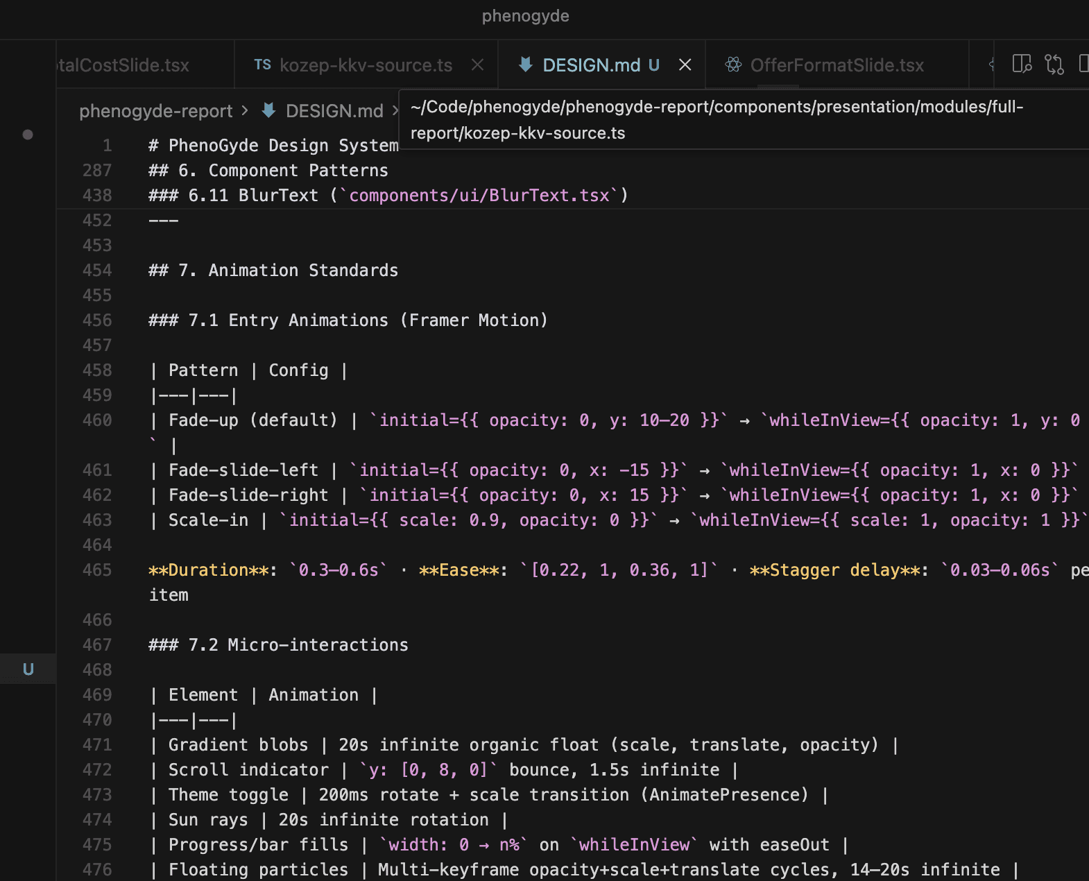
The decisions and the emerging rule systems go into these. Is all this just a reinvention of classic design-development processes? Maybe. But the idea-design-implementation cycle shrinks to a fraction of what it was, while leaving much more room for risk-free, creative experimentation.
This is a documented, asynchronous dialogue. The plans, specifications, and other project documents aren't static preparatory materials but living and changing transcripts of a project, brainstorms, and an increasingly consolidating rule system.
"What happens if, as a manager, you give a developer, designer, or analyst a task brief that's only formulated in ambiguous half-sentences?"
The model's output is non-deterministic, so the generated code can't be consistently of adequate quality, right? But the project's defined goals, structure, and design system are deterministic. The task is figuring out how to translate this into a language a model will be able to interpret to the right degree and produce output from.
5. The bottleneck is still taste
One afternoon in mid-April, six slides comparing pricing merged into a single interactive page in thirty minutes. The competitor map, which had previously been a static comparison table, became a force-directed bubble chart with a d3 simulation.
At one point, a chart that shows a zero-forint fee draws a 30%-opacity, minimum-width bar where the otherwise-missing "0 HUF" value would appear as a barchart. The transparency is a design decision. The minimum width is a design decision. And the fact that this change needs to be made at all is also a design decision. The model proposed none of these. For a data visualization to work intuitively, you need details like this in it.
The experience, the usability, is the product itself. The model generates the chart. The designer is the one who notices when a zero value gets interpreted as missing data, when a name slips badly inside a bubble.
Approving code spat out by an AI agent with your eyes closed and one hand: vibecoding. Making conscious design and UX decisions while designing software or a digital interface in such a way that an AI agent writes the code: outsourcing. :D
On disappearing professions and changed methods
This is where data visualization sharply parts ways from cookie-cutter dashboards. A Figma file can't filter and cross-reference; a Google Data Studio won't become a publishable premium product. Custom development — a parser script, a shared data model, a competitor map made with a d3 simulation — is the only way to simultaneously deliver the queryability of a database and the visual quality of a presentation. Tool choice isn't decided by fashion but by the density and structure of the data.
Vibecoding isn't a working method, it's a warning. Karpathy's original definition — diffs accepted without reservation, throwaway weekend projects — is untenable in a product sold into a regulated financial sector. What happened on the PhenoGyde project is closer to Simon Willison's vibe engineering: every modification is audited, the thinking stays with the designer, and only the production of text and code is outsourced. The difference isn't a semantic nuance — this is what separates "house-of-cards code" from a production-ready product.
And UX comes from where it always has: from taste and critical thinking. The experience and usability here are literally the product itself, and this is the layer that can't be outsourced.
At the intersection of these four areas, then, a new profession isn't being born — rather, an old role is taking on a new working method: the designer who defines a data model, writes a component library in prose, audits the output of agents, and fine-tunes with UX decisions what the model has produced. The bottleneck isn't speed and isn't code quality — it remains judgment, which decides what's worth doing at all, and when something is done.
Faq

How is 22 different from other UX/UI or no-code agencies?
We don’t do generic. Every project we take on gets a senior-only team, direct access to decision-makers, and an approach grounded in research, not guesswork. No bloated decks, no junior handoffs—just sharp, practical design work that moves your metrics.

What’s your typical process like?
Do you work with early-stage startups or just big brands?
Can you help us redesign our product or website?
How much does it cost to work with you?
What if we’re in a different time zone?